Monday, January 31, 2011

ETSY SHOP SALE

Starting tomorrow,
February 1st, 2011,
I'm having a SALE.


Come visit my Etsy shop tMoOT and buy yourself a new purse for Spring. I'm offering 30% off any of the nine Totes that are in stock, or any Custom Order. Just enter code SPRING30 at checkout.

Hope to see you there!!

Sunday, January 30, 2011

FREE ONLINE PHOTOGRAPHY CLASS

I discovered this Free Online Photography Class from a friend on Facebook.


It starts on Tuesday, February 1st.

Hope you all sign up to take it. It should be a lot of fun.

For some reason the Blog Button isn't working. Here's the link to The Joy Of Love.

Friday, January 21, 2011

OLD SCHOOL VALENTINE

Even though our house is Staged for Selling, I figured it wouldn't hurt to do a "little" bit of Valentine Decor. I mean, Holiday Decorating isn't personal... it applies to everyone, right? I guess if someone walks through our house, in the next couple of weeks, who is going through a divorce, then Valentine Decor may not be something they want to see. Oh well, I'll take that chance.

This "little" bit of decor cost me absolutely nothing, because I already had everything. I found a cute little metal frame in my stash, not realizing at first, that the metal was bent into the shape of four hearts... perfect for this Holiday. And, I already had red tissue paper - who doesn't?
The square opening of the frame is only 2" x 2", so I cut an 1.5" heart out of an index card. I then cut the tissue paper into 3/8" squares (not precisely, just eye-balling it). Then using the technique we ALL learned back in Elementary School, I adhered the tissue paper to the heart with Tacky glue and a small stylis.
To add a little bit more dimension, I elevated the heart off the background with a small piece of craft foam.

So, doing it "Old School", I was able to add a "little" bit of Valentine Decor.

Happy Valentines Day everyone.

I'm linking up here... be sure to go visit to see all the other incredible projects

Thursday, January 20, 2011

SELF PORTRAIT

One of the newest blogs I follow is Little Miss Momma. The little Miss Momma is Ashley, and she always has great little projects and incredible photography. Recently, she posted about how to do "Self-Portraits". I've been wanting to do this, so I got out my camera and full length mirror this morning and gave it a try.

Here are a few of what I captured.... and Ashley was right, you need to take about 100 shots just to get a few good ones.
This first one is probably my Favorite. I e-mailed it to my husband, and he thought it was "Weird" - "your head's cut off, you're looking up, your mouth is open, you look like you're lost." I told him it wasn't Weird, it's "Artistic". He then told me that even though it's Weird, I'm still beautiful. Gotta love my Hubby.

My boy's bedroom seems to have the best lighting for photography, so after moving the crib out of the way (for most of the shots) I got to work.

The above two were before Makeup.


This one really highlights the beginnings of my second chin.... FAB-U-LOUS!!
After the boy's room, I moved to the Master Bedroom... and tamed my frizz.

Not all pics were just "Self"...
Porkchop and Mommy
Luke and Mommy
Mommy and Porkchop again(his real name is Grey). This was the only "Silly" face I could muster.

Go visit Ashley's Link Party to see all the other great "Self-Portraits".

Sunday, January 16, 2011

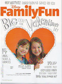
FAMILY FUN FAMOUS

Who'd a thought a skein of brown yarn would give me 15 minutes of Fame?

Remember this from Halloween?
Well, this yarn wig made it into the pages of a magazine.

The February issue of Family Fun.
The October issue of the Family Fun magazine is where I got the tutorial for the basics on how to make yarn wigs. The wig for Princess Leia wasn't actually one they showed how to do, nor were they being shown to be made for adults. But I figured if I followed the basics, I could modify it for an adult, and whip up the Cinnamon Bun hairstyle made famous by the Star Wars Heroine.

The magazine always has a section where they feature photos sent in by readers, that show something that was made from one of the magazines how-to projects.

I didn't actually send in a photo, but instead, was contacted by the editor of this "Feature" section, who had found my earlier post about our Halloween costumes while surfing the internet. How freakin' cool is that?

So the Faucheux Family is Family Fun Famous!!!!


May the Force (still) Be With You!!

Saturday, January 8, 2011

CONCEALMENT ART

If you follow my blog, you know we have put our house up for sale. I thought I would share with you one of the transformations I did in order to de-personalize our space.

On the large wall in the living room, is our wall mounted television. When we purchased it five years ago, we were too cheap to go to the expense to have an electrician come out and do what would be necessary in order for it to hang and not have any of the wiring show. This was my solution.

Normally, before "staging" had to be done, the little frames held photos of our three boys
Luke is on the left and is Three months old in this shot. Grey is on the right and is also Three months old. In the middle is our sweet Angel Max, Luke's twin. This photo was taken the day before he passed away at Three weeks old.

Now they have some colorful scrapbook paper and are embellished with brown Fleur-de-lis' - subliminally still personalized, symbolizing my husband's home town of New Orleans.

When I originally created these, I painted three canvases (without staples on the sides) that I got, probably, at Michaels.
I got the grass cloth square frames at Ikea. I then used carpet tacks (hammering them into the wood frame through the canvas) and twine to hang the frames.


So simple, so inexpensive, so cute... and they (mostly) hide the wiring.

I'm Linking up here... be sure to go there to check out all the other awesome ideas.

Monday, January 3, 2011

HOUSE FOR SALE

As I posted last week, my husband and I frantically spent the week between Christmas and New Years getting our house ready to put it up for sale.

This is why...
We found this 200 year old farmhouse the week before Christmas and Absolutely FELL. IN. LOVE!!! However, a couple of days later, we came to the conclusion, that for us to be able to purchase this Dream Home at this time, just wasn't in the cards. So, we gave up that dream, and started working on another. But in order for ANY new home Dream to come true, we need to sell our current home FIRST.

I thought I would give you all a little tour of our home, and show you all that we've done to get it ready for hopefully a QUICK sale. And amazingly, we spent ONLY about $100.

When you first walk in, you are immediately greeted by all the natural lighting that streams in from the floor to ceiling windows.
Before visiting the Great Room area, you will be immediately drawn to the right to see the beautiful Modern Cherry Kitchen. The first stop is the bar area - complete with glass front cabinet, pigeon hole wine rack and stemware rack. This area also has a pantry cabinet, pull-out trash cabinet and tray storage cabinet.
The feature wall includes a stainless steel, glass top electric range with stainless steel hood. There is a glass front, flip-up door wall cabinet for dish storage and a pull-out spice cabinet next to the range.
The backsplash is a 1" x 2" concrete tile and the countertops are a mix of Solid Surface and Maple Butcherblock. There is a large, single bowl, deep, stainless steel, undermount sink, with a tilt-out drawer front for sponge storage. The window above the sink is a nice atrium window.
We have a 33" side-by-side, stainless steel Refrigerator with a full depth storage cabinet above. To the right of the fridge is another pantry cabinet, and some custom display shelves. When I designed this kitchen, I didn't want to fill all the walls with cabinets, so I left space for artwork to the left of the window, and to the right of the window we installed two Ikea stainless steel shelves for additional open storage.
Also in the kitchen space is our Laundry room... small but efficient... and painted Orange.
Now, back to the Great Room. In the Dining area is the great Stone Fireplace, which you have all seen in past craft project posts.
The Dining area is large enough for our large 8' table we got from Crate & Barrel. To jazz up the wall of the Entry area, we expanded on the Kitchen design and installed the two tone wainscot paneling.
Because of the large sliding glass doors and the high ceiling, the living room feels quite spacious.

The spiral staircase leads up to the loft, which I use as my craft room.
When I'm up there working, I really should wear a hard hat. The ceilings are quite low, and I've had many a goose egg on my nogen.
We actually had a futon up here, but removed it for the staging. It's so nice how open that end of the loft is now, and how you can look out over the Great room below.
The boy's room probably received the most change. Originally, the entire bottom part of the walls were painted the same green as the custom bookshelf. The realtor suggested we paint it something more neutral. I still wanted a two tone look, so we went one shade darker of the same tone of khaki, but we kept the bookshelf the original color. I also had to create some new non-personal artwork. I made the "PLAY" artwork over the bookshelf using my Cricut and black frames I already owned.
I also made the "Alphabet" - again using my Cricut and a frame I already owned. I subliminally personlized it by using a different colored paper for the "L" and "G".
I miss the green, but this neutral palette is nice too. There is definitely still plenty of color in this room from all their toys.
The Master Bedroom just needed a little de-cluttering.

Same with the Master Bathroom. That tall Maple cabinet in the photo above used to be in the bathroom. We moved it to the bedroom to make the bathroom appear larger.

The office (or third Bedroom) also just needed a little de-cluttering. I've posted about this room before back when we pulled it all together in September.


The Guest Bathroom, which is accessible from the Office and the Entry area, got a complete facelift. Using the left over paint from the Boy's room, we painted it to make it more appealing for re-sale. Before the re-do, it was an ocean blue color.
I think it is screaming for some more color, but that will have to wait for now. I guess I need to think about adding some colorful artwork.
So, if any of you are looking to buy a Weekend home, on a beautiful lake in Central Virginia, be sure to stop by and have a look.

This has been a Great first Home. We've created wonderful memories here. We got married while living here, and then brought home our beautiful baby boys. We will miss it, but look forward to something larger with a yard for the boys to run and play.

I'm linking up here... be sure to visit to see all the other great projects.